Deal overview
Gives you a look back at the history of deals.
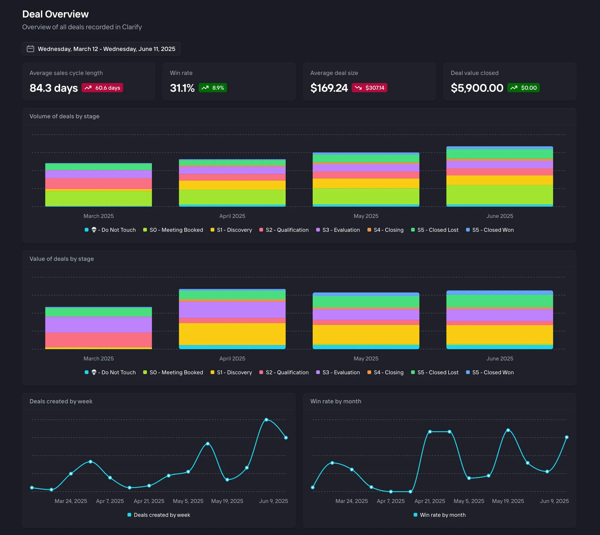
The purpose of the deal overview dashboard is to look backward at the history of deals. Here is an explanation of each chart.
Win rate
This chart shows the percentage of deals that were successfully closed as "Won" compared to all closed deals (both Won and Lost) within a specified time period. This metric helps sales teams understand their overall success rate in converting opportunities into closed deals. The chart excludes deals that are still in progress, focusing only on completed sales outcomes.
Average deal size
The Average Deal Size chart calculates the mean value of all deals that were opened within a specific time period.
The calculation includes all deals created within the specified time period, regardless of their stage.
Average sales cycle length
This chart measures the typical duration between when a deal is created and when it reaches a closed state (either won or lost). The chart helps identify if sales cycles are becoming longer or shorter over time.
The calculation specifically looks at the time difference between a deal's creation and its first transition to either a Closed won or Closed lost stage.
Deal value closed
This chart shows the total monetary value of all deals that were successfully closed as "Won" within a specified time period.
More specifically, this will sum any Closed won deals that have a Close date between the selected time range of the dashboard.
Value and volume of deals by stage
This chart shows the total monetary value of deals at each stage of the sales pipeline over time. More specifically, this will show the number and value of deals that you had at the end of each time bucket in the chart.